January 2022 – Monthly Commentary

Without a doubt, the Federal Reserve should have raised the overnight interest rate interest rate today, February 10th. The Bureau of Labor Statistics (BLS) released the January inflation report and, again, it shocked to the upside. Consensus expectation was that prices would have risen 7.3% year-over-year. Instead, prices rose 7.5% over last year’s basket. The Fed has 2% as their stated target for inflation and when inflation began to exceed that target last year they revised the mandate somewhat to say 2%, on average, given the vagaries of the economic cycle.

Parsing the individual components of the inflation report, the only category that did not exceed 2% was education, rising 1.7% for the year. At the opposite side of the spectrum, energy was up 27%, and the gasoline subcomponent was up 40% compared to last year. For the same period, new car prices rose 12.2% and used car prices rose a whopping 40.5%.

Halyard’s View on the US Inflation Debate

The Federal Reserve’s June meeting was viewed as a hawkish shift.  A shift in rhetoric only, as the Fed will maintain its current ultra-easy monetary policy for the near future.  Recall from the previous FOMC meeting on April 28th, Powell reiterated that they believe the uptick in inflation will prove transitory and they were comfortable with the status quo.  When pressed on whether the committee had begun discussions on how taper would be enacted, he responded that they “haven’t even talked about talking about taper.”

Employment Growth on Sustainable Path

Below is a chart, we think you might find interesting.   We plot the total number of employees counted in the non-farm payroll survey (left scale 000s) and the number of Job openings (right scale, 000s) as tracked by the BLS’ JOLTs survey.

Key observations:

  • Number of Job openings has surpassed last previous peak
  • Number of employees on the non-farm survey has surpassed the previous peak (when we were in the midst of a housing and construction bubble)
  • Rate of growth in non-farm payroll growth did slow in 2013 – In our opinion reflecting fiscal policies, the roll out of Obamacare, and the continuation of extended unemployment benefits.

o   As those policy effects fade, non-farm payroll growth re-accelerated in 2014

  • Job openings show continued payroll growth

Payroll Chart

LIBOR Continues to Misprice Fed Rate Hike Expectations

We put together a quick graph of short term interest rates and the market’s expectations of future rates.  The current LIBOR curve as measured by the LIBOR Futures market predicts rates to rise to between 1.09% and 1.95% from December 2015 to September 2016 (Charted as the blue shaded line below).  We then assumed that the Federal Reserve would begin to raise the Fed Funds rate in March 2015 and do so in 25bps increments at each subsequent FOMC meeting (The expected Fed Funds using that scenario is plotted in Red).   Historically, LIBOR trades at a spread to Fed Funds (approximately 50bps).  We then derived an expected LIBOR curve based upon the expected Fed Funds rate (Charted as the green line).  This shows that the LIBOR Futures market is currently under-estimating the rate rise even under a very gradual FOMC path.


LIBOR


Source:  Eurodollar (LIBOR) Futures Curve – 9/19/14


Financial Times – 7/17/14

Michael Kastner, principal at Halyard Asset Management, says the increased regulatory oversight on US global banks means a catalyst to drive their share price higher is no longer present. He says investors are trying to work out whether “the Fed wants these banks to be innovative and create new products that can drive earnings or are we going back to an older safer banking model”.

The divergence between banks and their price to book ratios is not surprising says Mr Kastner. “Global banks have exposure to all the problems in other parts of the world so investors have to consider what these institutions have on their books that they may not know.”

Bank bonds gain edge on stocks as risk factor fades

Financial Times – 6/2/14

Michael Kastner, principal at Halyard Asset Management, said: “It’s embarrassing for ISM, we usually get a revision a month or so later.” After the initial print that was softer than expected, Mr Kastner said: “I was scratching my head when it came that low.”

US data mix-up sparks market swings

Corporate Profit Growth Fuels Shareholder Returns through Dividends and Repurchases

Corporate Profit Growth Fuels Shareholder Returns through Dividends and Repurchases

Share repurchases by S&P 500 companies increased 19% in 2013 – with a total of $129.4 billion executed in the fourth quarter.  This was a 1% increase compared to the 3rd quarter and when combined with quarterly dividends, represents the second highest quarter of dollars returned to shareholders on record.  The previous high was recorded in 2007.

The share reduction has been widely quoted as being the primary driver of the 15% rally in the S&P index during the 2nd half of 2013.  Below, we take a look at the statistics in greater detail.

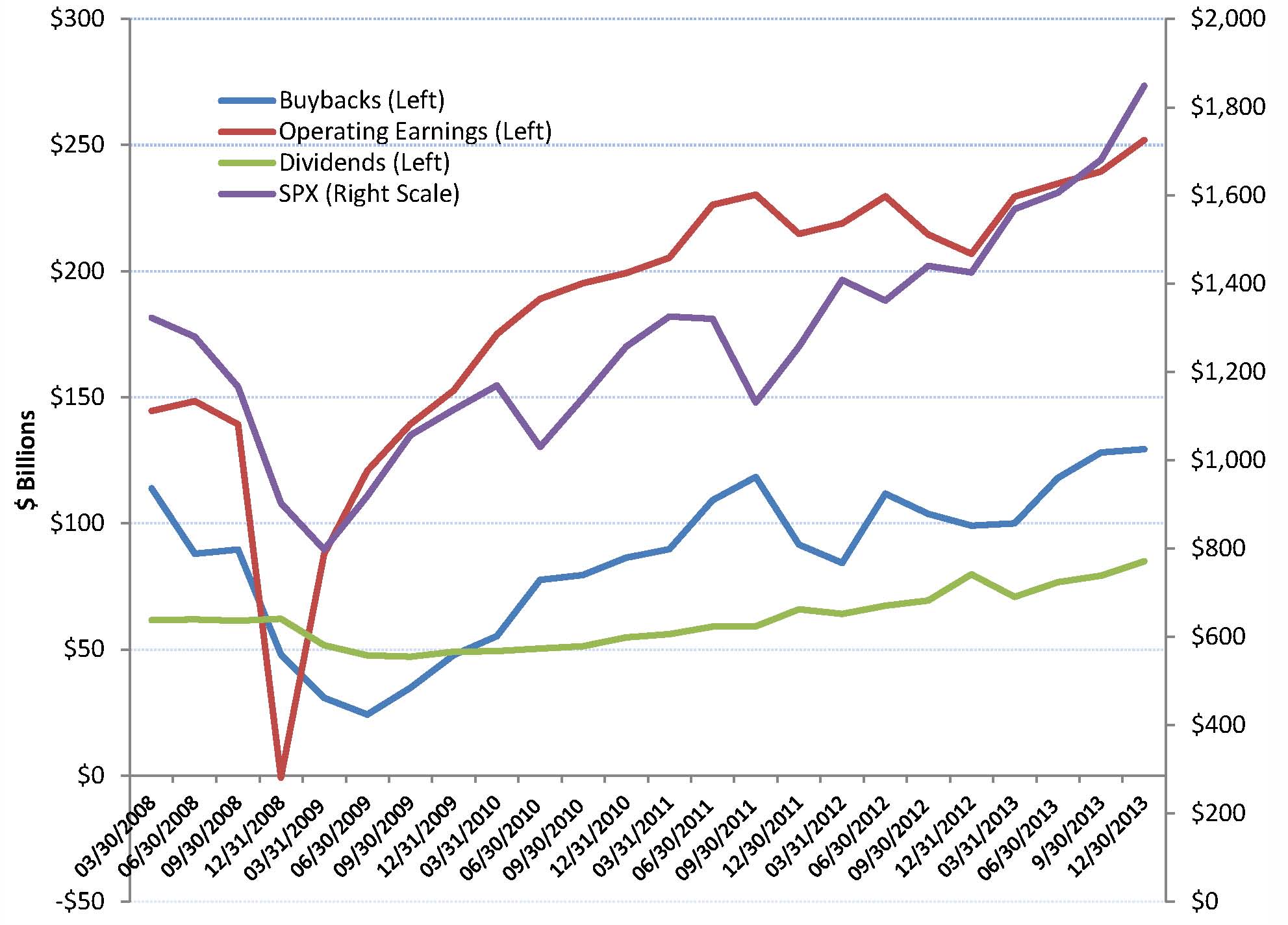
Chart one, details the quarterly dollar amounts of dividends, buybacks and operating earnings on the left scale.  The quarterly S&P 500 Index is graphed on the right scale.  As the economy recovered from the 2008 recession, we have seen steady growth in the quarterly dividends and an upward trend in buybacks – although at a slightly more erratic path.  Intuitively, dividends and repurchases track operating profits.  The S&P 500 index tracks operating profits pretty closely.

Chart 1:

Source: S&P – Quarterly Buybacks, Operating Earnings, Dividends and S&P 500 Index.  Data is through December 31st, 2013 (Preliminary).


Chart two, compares the dollar amount of quarterly repurchases to operating earnings and market capitalization.  Interestingly, repurchases have averaged about 45% of operating profits since 2008.   For 2013, repurchases averaged 49.7% of operating earnings, with the last two quarters exceeding 50%.   The second line on chart two depicts share repurchases as a percent of the S&P market capitalization.  Buybacks have averaged 74bps of market cap since 2008.  Looking at the chart, one might conclude that the buybacks have been a relatively stable percent of market cap, except for the 3rd quarter of 2011 – when buybacks continued to inch higher and stocks sold off 15% due to the US debt default debacle.

Chart 2:

 Source: S&P, Repurchases as a percent of operating earnings and as a percent of S&P 500 market capitalization.


Chart Three depicts the dividend yield, the combined dividend and buyback yield with an overlay of the quarterly buyback dollar amount.  Both the dividend yield and the buyback yield have remained fairly stable over the last three years – a result of the slow rise in each coupled with the price rally in stocks.

Chart 3:

Source: S&P, Quarterly dividend yield and the combined dividend yield and buyback yield.


After recovering in 2009 and 2010, operating profit growth looks slow and steady.  Recall that dividends spiked during the 4th quarter of 2012 – ahead of tax increases.  We believe that the growth in dividends and buybacks will continue as corporate profitability increases.  The last few years, economic growth, as measured by GDP, increased 2.0% to 2.6%.    With the US poised to potentially reach a 3% rate growth rate, we believe corporate profit growth may accelerate.  As the rate of growth increases – pushing corporate profits higher, dividend and buyback growth should continue.

Chart 4:

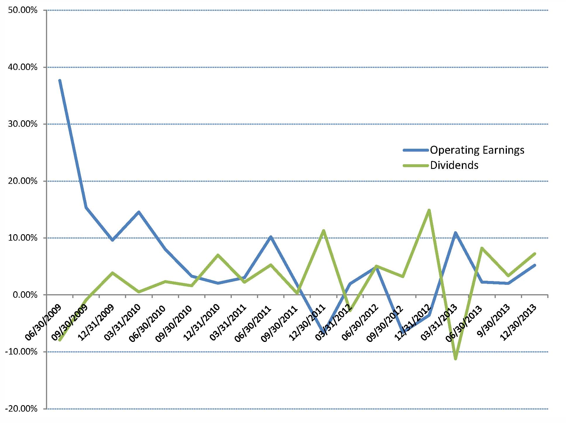
Source: S&P, Quarterly growth in dividend yield and the operating earnings.


Important Statement

This document is being provided by Halyard Asset Management, L.L.C. and its affiliates (collectively “Halyard” or “we”) for informational and discussion purposes only and does not constitute, and should not be construed as, investment advice, or a recommendation with respect to the securities used, or an offer or solicitation, and is not the basis for any contract to purchase or sell any security, or other instrument, or for Halyard to enter into or arrange any type of transaction as a consequence of any information contained herein. Any such offer or solicitation shall be may only be made at the time a qualified investor or client receives (i) a confidential private placement memorandum of the Halyard Fixed Income Fund, L.P. (the “Memorandum”), which describes risks related to an investment therein, or (ii) an Investment Advisory Agreement (“Advisory Agreement”). The Memorandum, including the risk factors and potential conflicts of interest described therein, or the Advisory Agreement should be read carefully prior to investment.  In the event of any inconsistency between this document and the Memorandum or Advisory Agreement, as the case may be, the Memorandum or Advisory Agreement will govern.  An invest in the Halyard Fixed Income Fund or a separately managed account may involve significant risks including the risk of loss of the amount invested.  In addition, certain investment practices employed including short selling and engaging in futures and options trading, may potentially increase the adverse impact on the Halyard Fixed Income Fund, L.P. or a separately managed account.

Although the information herein has been obtained from public and private sources and data that we believe to be reliable, we make no representation as its accuracy or completeness. The views expressed herein represent the opinions of Halyard Asset Management, LLC, or any of its affiliates, and are not intended as a forecast or guarantee of future results.  Opinions and estimates involve a number of assumptions that may not prove valid and may be changed without notice. Performance comparisons may not take into account any transaction costs, commissions or personal taxes. Past performance is no guarantee of future results and no assurance can be given that the Halyard Fixed Income Fund or a separately managed account would achieve favorable or comparable investment results or that the Halyard Fixed Income Fund, or a separately managed account’s, investment objectives will be achieved or that the investor will receive a return of all or part of their investment. There can be no assurance that any estimated returns or forward looking assumptions contained in enclosed materials will be realized or that actual results will not be materially lower than those estimated.  There is always the chance that investment performance might deteriorate in the future, and clients may experience capital losses in the market value of their portfolios due to material market or economic conditions.


Municipal Bonds – Value in a Risky Interest Rate Environment!

Municipal Bonds – Value in a Risky Interest Rate Environment!

•    Municipal Bonds Attractive Relative to US Treasury Notes –  Again
•    Increase in yield to maturity a welcome development….But the rate is still low!
•    Targeting AA rated paper as investors sold good bonds into a bad market
•    Implementing interest rate hedges to offset higher rates

Many investors are smarting from shockingly negative returns in bond funds, including ETFs and closed end funds.  Thus far, in 2013, longer maturity Municipal bonds under –performed a dismal US Treasury market.  Municipals have been in excess of 100% of UST Treasury Notes for most of the year, as tax concerns and the absolute low level of interest rates curtail demand.  Fed Chairman Bernanke’s remarks in June, fostering the first hints of removing excess monetary stimulus, left the highly overbought fixed income market in disarray.   The yield to maturity for 5 and 10 year AAA rated municipal bonds rose 46 and 97bps, respectively, for the year through July, – with the 10 yr more than out pacing the rise in UST notes of 84bps.  The 30 year sector of the municipal market radically under-performed US Treasury Notes with the yield to maturity rising 138bps compared to the 71bps rise in 30 year US Treasuries.

For example, the Barclay’s Municipal Bond Index has declined 3.9% in the last six months, pulled down by the 8% decline in the long portion of the index (22+ yrs).  This compares to a drawdown of 1.6% for the Barclay’s Aggregate and 6.3% decline in long maturity government bonds as measured by the Barclay’s Long Government Index.

Although the rate rise was sharp, it is reasonable to believe that this was just the beginning of the correction to more normalized interest rates.  However, we think that this period of under-performance provides a short term opportunity to pick up relative value, however, we are uncomfortable being long only and prefer to extend into municipals in a hedged portfolio.

According to data compiled by Bloomberg, new issue supply in the municipal market, has fallen to about 90% of last year’s pace.  The market appears to be on a track for approximately $320 billion in supply or slightly below average for the past five years.  Credit quality, measured by the total amount of state revenues collected showed strength – leading to improvement in the budget positions of many municipal entities.  “Belt tightening” and longer term fiscal planning are easing expenditure pressure.

In the last two months, we have witnessed a sizable amount of redemptions of municipal bond funds – and the corresponding cheapening of municipal bonds relative to US Treasury Notes.   Much of that selling can be attributed to a few catalysts – a question of long term tax changes, low absolute yields in US Treasury and Corporate paper, and the beginning of the wind-down of the Fed’s US Dollar printing i.e. – tapering QE.  As new issuance continues to wane in the near term summer season, we think the municipal market may improve relative to UST notes.  Although municipal bonds are cheap to US Treasury Notes, the yield to maturity is still, despite the recent rise, at multi-decade lows – resulting in a risk reward payoff that is skewed to the downside.

In our opinion, the Federal Reserve is encouraging investors to increase risk to enhance income.  This can be accomplished in several ways including extending maturity and shifting down into lower rated credit.  We view the risk reward trade off as favoring an investment in a portfolio of single A rated average credit versus the more typical AAA or AA rated average portfolio.  The credit risk premium for single A and BBB rated credits is still attractive.

We recommend that investors lessen their sensitivity to interest rates by shortening the average maturity of the portfolio or by implementing a portfolio of interest rate hedges.  Interest rate hedges are positions that increase in value as interest rates rise, thus offsetting the mark-to-market loss suffered on a long only portfolio.  Also we recommend that investors review the vehicle they utilize to access the bond market.  After the wild ride that ETFs experienced relative to the underlying market, we continue to recommend portfolios of individual bonds.

ETF’s “Gate” liquidity

Did fixed income ETF’s sing their swan song yesterday?  Maybe not, but after the abysmal performance yesterday, investors must reevaluate the risk and liquidity of an ETF before assuming the product is a cost-effective proxy for a diversified fixed income portfolio.  In the midst of the fixed income rout, ETF sponsors found themselves unable to absorb the selling.  The Financial Times quotes a Citi e-mail in which the trader wrote, “We are unable to take any more redemptions today…due to capital requirements we are maxed out.”  In the same article the global head of ETF capital markets at State Street was said to contact participants “to say that we were not going to do any cash redemptions today.”  While the fixed income market has been volatile over the last two days, it was not in a state of panic, and yet a number of ETF sponsor effectively “gated” redemptions.  Attached below is an excerpt from our January 2013 monthly write-up describing the risk inherent in the ETF market, and a link the Financial Times article.  Please don’t hesitate to call if you have any questions.


“As we’ve discuss on several occasions, the structure of an ETF has the potential to destailize markets should investors rush to sell.  One way to measure market liquidity is to divide the market capitalization by average daily volume, which yields the average number of days to turn over the index.  A lower turnover rate is indicative of a more liquid market.  The two largest high yield exchange-traded-funds manage a combined $27 Billion in assets, representing 468 million shares.  The daily volume for the two total 9 million shares, or 1.9% of total shares outstanding.  By comparison, 7.5% of the market capital of the S&P 500 changes hands on a daily basis.  Based on those statistics, the S&P turns over every 13.3 days, while the two largest high yield funds turn over every 52 days.  To further the point, the constituents in the S&P 500 are widely followed, actively traded companies.  The same can’t be said of a number of bonds in the high yield ETF.  The conclusion as we see it is that should an event “spook” investors, the rush for the exit is likely to worsen the selloff.”

http://www.ft.com/cms/s/0/82d66636-d9ec-11e2-98fa-00144feab7de.html#ixzz2WrMoYDV4

https://halyardmgmt.com/january-2013-commentary/

Could it happen here?

Could it happen here?

The recent news that the government of Cyprus is considering a one-time tax on the saving deposits held at Cyprus based banks is yet another example of the riskiness of holding more than a nominal amount of cash in a bank account.  While Cyprus if far different from the United States, both in terms of the fiscal state and banking oversight, it’s yet another example of why savers and investors need to be vigilant in mitigating the risk to their supposedly risk-free assets.

We spend much time and effort trying to educate investors that leaving cash in a bank account is tantamount to giving the financial institution an unsecured loan.  If all goes as expected, the entity will return your money, along with a few basis points of interest, when you want it.  If the bank “stumbles” in one way or another, the depositor may or may not get most, some, or very little of their money back, at some point in time.

Financial regulators would have us believe that the risk of a major financial stumble has been reduced to the equivalent of the one in 100 year flood, but the capital markets have been forced to confront the one in 100 year flood annually.  Despite the heightened frequency, investors remain complacent to such a risk.  Over the course of the last five years, unlucky savers have had their cash encumbered by the fall of Lehman Brothers, the failure of The Reserve Fund, the failure of MF Global, the collapse of UK-based Northern Rock plc, the collapse of the Icelandic banking system and now the potential for outright theft of cash from Cyprus savings accounts.  The list of banks that have been forced into a near-panic situation due to their own malfeasance is nearly as long, and includes HSBC and Standard Charter Bank, accused as money launders to the terrorist and drug dealer community, UBS, with their alleged proactive strategy to help U.S. citizens evade U.S. taxation, and the multitude of money center banks that are facing enormous legal liability for manipulation of the LIBOR interest rate.  We also believe that money market mutual funds are equally fraught with risk.  Investors seemed to have forgotten the dire and urgent warning sounded by former Securities and Exchange Chairwoman, Mary Schapiro, that the money market industry poses substantial systemic risk to investors and the capital markets.  Ms. Schapiro, together with former Treasury Secretary Geithner, drafted a proposal to the Financial Stability Oversight Council requesting immediate action.  Unfortunately, with the change in the administration, it appears those concerns have fallen by the wayside.

Given that list of “eyebrow raising” failure and malfeasance, one would expect that investors would demand substantial compensation to make an unsecured loan to these financial entities.  Instead, according to the FDIC, the average savings deposit rate in the United States is 0.07% per annum.  Similarly, the average return on a taxable money market fund in 2012, according to IMoneyNet was 0.04%.  Such miniscule returns hardly seemed commensurate with the risk assumed.

At Halyard we believe that investors deserve a more sensible alternative to money market funds and bank deposits.  That is why we established the Reserve Cash Management Portfolio Strategy (RCM).  The RCM is designed to provide an alternative to money market funds and bank deposits with the primary objectives of preserving principal and providing liquidity.  However, unlike money market funds each account is separately managed and customized to deliver attractive yield while meeting the specific goals and objectives of the client.  That structure mitigates the risk of an unforeseen 100 year flood wiping out what had been considered cash.  The graphic listed below offers a side-by-side comparison of the RCM versus bank deposits and money market funds.

Please call or send an e-mail if you have any questions.


1 Source:  Rule 17 CFR 270.2a-7 of the Investment Company Act of 1940.